Product + Presentation is the key in today's world. One cannot survive without the other. presentation would include every aspect from location to the sales executive to the window display, it has also become an integral part of the product itself.
This in the true sense is a ERA of design.
India is country where festival come once in a month, lots of cultures, religious, etc. For each festival people buy new clothes, gold, jewelry, car, etc. Shopping sites offer promotions & niche products based on the festivals. No matter what country you are in, you always love discounts when you shop, so here also the same.
I will discuss about Indian Shopping Websites and their User Experience Design & Usability. I will also share some my experiences in online shopping. First we will discuss about the UX elements which needs to be added in eCommerce website. Elements which balance your website or product.
Elements of UX for eCommerce
There are four elements which need to balance in every eCommerce website or app. Value, Desirability, Adaptability & Usability. All these elements are equally important.
Sometimes product have good usability but doesn't get success in market. It's an alignment between product features and user needs. It is also depends on your business strategy.
Usability
It's depend on how easy to complete task. eCommerce site or app should be usable and useful to the user. User should be able to search any product which he want, user should fill the checkout forms very easily, and also perform all other tasks very easily. Shopping portals should be easy to use, easy to shop.
Value
It refers to providing value to user. It also helps you to make more business on your website or app.Sometimes product have good usability but doesn't get success in market. It's an alignment between product features and user needs. It is also depends on your business strategy.
Adaptability
Its a critical element in eCommerce. It relates users to buying and start using a product. Very closely related to Usability. If users found value in product, but they face some difficulties while using the product, then they will stop using that.
Desirability
So these are the UX elements which equally important and should be used in eCommerce website or app. These elements not only helps to engage users also help to make users or customers happy.
Let's check out, top shopping websites in India and their User Experience and Usability.
Flipkart.com
Launched in 2007, by Sachin Bansal who had been working for amazon.com. In initial years the focused on selling books, later on they expanded. with other products. This is a website who help majorly to increase online shopping in India.

Usability of this site is good as feel easy to complete tasks. Accessible Search, Filtering products as per user need, Quick View of products these are some nice elements in website. Very good thing about this website is, it doesn't disturb you with Google ads. Images and Banners are very nicely used to attract customers. Checkout process is also smooth and easy to complete.
In Flipkart.com we found Usability, Value and Adaptability too. But there is no Desirability. If they balance desirability, marketplace will be more higher. Shopping with fun can be very different experience for user. There is no pleasurable experience or fun while shopping. No emotional attachment with customer while shopping or after shopping.
Apart from this, website doesn't respond properly on tablets like iPad ( they have app for this but website should work also) or on touch screens. Apart from product site doesn't leave any experience to come back and shop here, user can go other site. It doesn't include any latest web trends like responsive, mobile first, touch screens enable, etc.
Indiatimes Shopping
Oldest shopping portal in India, launched in 2000 by The Times Group. One of the pioneers of eCommerce in India.

Recently redesigned with new look and feel. New way of search, navigation, product listings, sliders, banners, etc. They are providing Value to their users, from last 13 years. In recent redesign site improve Usability. Categories and Sub Categories are very easy to navigate. Product filter is also good, not so much cluttered. Footer is very nicely done in this website for SEO purpose.
In redesign site designers should consider latest web trends. Mobile First, Responsive Web Design, Touch screen features, Media Queries, JS elements, etc. missing in site. Currently this website does not stand in top 10 shopping portals of India. From redesign of website they improve usability, but Value and Desirability is not balance.
I bought HTC Nexus One from this website, when they courier me my mobile phone, it was one one plastic bag of Indiatimes Shopping, which was not reusable. No branding in delivering products.
tradus.in
It's owned by ibibo, after buying buytheprice.com they become more bigger. Now they stand on 3rd rank of top Indian Shopping portals.

This is Responsive Website among these top Indian shopping portals. It also have some touch screen supporting features. Navigation is good, in responsive way, when you go from mobile it recommends you to download the app. Good use of colors and fonts, Banners are also nicely done. Good design in Checkout process.
Good Value and Usability but Desirability also does not balance in this site too.
On homepage, navigation bar only scrolls with you, for choosing category you have to scroll top. Filter bar on Listing page, allows you to choose categories, to choose sub category you need to access top navigation menu. Overall this site score more in usability and good UX.
Myntra.com

Very clean and clear design, which matched the latest design trends. Nice use of images, fonts, colors, makes impact of style products to the customers. Navigation is also good, Good design of forms, White space is also nicely used.
This website get user's emotional appeal and balance desirability in some ways. Use of stylish apparels, accessories in Images, attract users to get more stylish products. User get experience of watching & shopping fashion and stylish products.
As we discussed, product can perform with poor usability when it have desirability. This site may not found you easy to complete task, but with desirable products site get success in marketplace.
So these are the top shopping websites in India, and we gone through their usability and UX review. Also we check the balance of UX elements in these websites.
Still, What they are missing?
Many Shopping websites from India, are well designed, good usability but they missed out latest design trends. Responsive Web Design is very useful and important feature or trend of Web Design. Mobile First strategy is one of the important part for increasing Mobile eCommerce. Flat UI design helps you for touch screens. These are latest trends which should include in their website.
Apart from the product what users get?
Many people in India, are started buying online; as websites or online stores offer to pay cash on delivery, emi options, 30 days trial, etc. Shopping websites also created trust with their customers. But apart from that product, what they are giving to their customers for shopping more, again and again.
Do you shop from same website, again and again? Discounts, coupons, offers, sale, etc. given to their customer every shopping website. What user or customer want?
From one shopping portal (inkfruit.com), I bought few t-shirts, they give me some stickers, which was surprise for me (everyone like surprise) and it was good. I post that sticker at my office desk. One of my coulige saw that stickers and he also ordered shirts, just for the same stickers.
So, What should shopping websites give to their customers ?
Applying Desirability and Pleasurable Experience or Fun
1. Give Free Goodies
Stickers, labels, tags, paper bags, etc. people love to use, people love to show brand which they buy. It will also help websites to promote themselves.
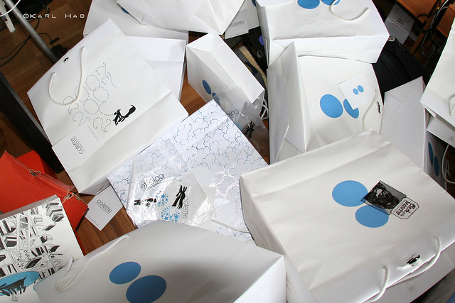 |
| Shopping Paper Bags which can use user for other purpose |
2. Apply Gamification
Gamification is applying gaming techniques in your website, app or service. It help you to make user engagement and giving pleasurable experience with fun. With use of gamification many user get strongly connected to website, app or service.
3. Personal touch
We already discussed that India have many festivals, online store should send greeting to their regular customers, not my email, a real greeting. Should wish their birthdays to make personal attachment. For example, People buy cameras from website, what if we give them photo frame free for their photograph. Ask them if they want to wrap as gift, give it for free of charge.
4. Surprise them
4. Surprise them
Everyone love surprise, when it comes with good emotions. Give them some free stuff, promotional products, toys for their children, accessories for wife or girlfriend, or parents. This experience will bring back your customer and also make you different than others.
User think about size, fittings, material, color, etc. of product before buy. If every shopping website can have their one real shop in one city, where they can exchange the products and other services. It will help to build trust and confidence for buying products online.
5. Build Trust for Online Shopping


